HOW TO MANAGE WEBSITE CONTENT
Image Terms and Licensing
Image licensing can sometimes be difficult to understand. In the questions and answers below, we do our best to provide answers to common questions that have come up.
Website Builder works with multiple image providers, and it is important to know the source of the image you are considering using on your site as different images have different licensing terms. Once you select an image in the image picker, you will see the source of the image on the right side (highlighted in red in the image below). Some of the images might not have a defined source and will not show that information. In the questions and answers, make sure to refer to the answer that corresponds to the provider source of your image.
For the full terms related to the usage of the Website Builder platform, refer to our terms of service and privacy policy. In any conflict between what is written here and our terms of service, the terms of service prevail.
FAQs
What are the licensing terms of images?
- Unsplash: all images are licensed under the Creative Commons Zero (CC0). Which means you can copy, modify, distribute and use the photos for free, including commercial purposes, without asking permission from or providing attribution to the photographer or Unsplash.
- Giphy: see the full Giphy terms: https://giphy.com/terms
- ShutterStock: see the full Shutterstock terms: https://www.shutterstock.com/license
- No defined source: You are granted an individual, non-exclusive, non-transferable, right, throughout the world, in perpetuity, to use such image, or any part thereof, an unlimited number of times, solely as incorporated into websites built using the Website Builder.
Can I use the same image multiple times on a single site?
- Unsplash: Yes
- ShutterStock: Yes
- Giphy: Yes
- No defined source: Yes
Can I use the same image on more than one site?
- Unsplash: Yes
- ShutterStock: No, an image can be used for a single site.
- Giphy: Yes
- No defined source: Yes
Can I use the image on other digital or physical assets that are not my site?
- Unsplash: Yes
- ShutterStock: No, an image can be used for a single site.
- Giphy: Yes, as long as you adhere to the Giphy terms.
- No defined source: No.
Can I get a refund for an image?
- Unsplash: Not relevant, Unsplash images are free.
- ShutterStock: No, we do not provide refunds for purchased images.
- Giphy: Not relevant, Giphy images are free.
- No defined source: Not relevant, these images are free.
Q. Can I edit, change an image?
- Unsplash: Yes
- ShutterStock: Yes
- Giphy: No, this is not allowed according to the Giphy terms.
- No defined source: Yes
Do I need to give attribution to the owner of the image?
- Unsplash: Not required, but would be appreciated.
- ShutterStock: No
- Giphy: No
- No defined source: No
Q. What other terms do I need to comply with?
- Unsplash: None
- Giphy: All terms described in the Giphy terms.
- ShutterStock or No defined source: You shall not use any image:
- except solely as incorporated into your responsive website, mobile website, Web Personalization created using the Service.
- together with pornographic, defamatory, or unlawful content or in such a manner that it infringes upon any third party’s trademark or intellectual property rights.
- portraying any person depicted therein (a "Model") in a way that a reasonable person would find offensive, including but not limited to depicting a Model:
- in connection with pornography, "adult videos", adult entertainment venues, escort services, dating services, or the like
- in connection with the advertisement or promotion of tobacco products
- as endorsing a political party, candidate, elected official, or opinion
- as suffering from, or medicating for, a physical or mental ailment
- engaging in immoral or criminal activities
- as a trademark, service mark, or logo.
Image Size Guidelines
Each time you upload an image, up to 5 reduced-size copies of the image are created. Website Builder then automatically inserts the appropriately sized image into the desktop, tablet, and mobile sites, making sure your site visitors always see the correct sized image for their device.
Optimized Image Sizes per Device
Image Type
Image Width Background - 1980px
Desktop - 1660px
Tablet - 1440px
Mobile - 600px
Thumbnail - 150px
The size of the uploaded image is not increased and only images that are smaller than the original are created. For example, if a 2000px width image is uploaded, 5 new optimized copies will be created. If a 100px width image is uploaded, no new images will be created.
Maximum Image Size
The total area of an image cannot exceed 3,145,728 pixels. It is unlikely any of your images will be over this limit, but you can quickly check by multiplying the pixel width by the height.
Image Size Guidelines per Widget
Slider
The Slider widget is normally used with larger sized images for dramatic effect. Sliders commonly stretch from end to end, so it is good to use images with more width to fit the slider. For square sliders, use an even aspect ratio such as 1:1.
It is best to choose images with good padding so that the main content of the image is not cut off when resized. The image ratios should be the same in the slider for design consistency.
- Common aspect ratios: 16:9, 3:4
- Common resolution sizes (px): 1600x900, 1280x720, 1280x960
Note
Mobile devices often have the opposite aspect ratio compared to desktop devices. You may have to use the hide on device feature to display mobile sliders correctly.
Photo Gallery
The Photo Gallery widget is the most flexible widget to use with images, because there are so many layout options. For example, you can have a tiled gallery which is the same size for all images, or mosaic which is a different size per image.
The aspect ratio of images in the Photo Gallery should reflect how you want it to display.
- For example, square style galleries should have 1:1 ratio of images.
- Tall image style galleries should have longer height ratios, like 2:5, or 200px by 500px.
The image ratios should be the same for design consistency. Leave some padding in the image to use the hover effect so that your images do not get cut off.
- Common aspect ratios: Any aspect ratio.
- Common resolution sizes (px): Any resolution, but not larger than 1500px for page speed.
Icons
Icons are a very important part of any site. They are visual markers for information and can add a modern look to your site. You can use transparent PNGs, JPEGs or SVGs.
- Common aspect ratios: Generally 1:1, but any aspect ratio will work.
- Common resolution sizes (px): 200x200, 80x80 or any resolution. SVGs can be any resolution.
Favicons
Favicons are not used on your actual site, but rather displayed on the tab when users open your website.
- Required aspect ratio: 1:1
- Allowed resolution sizes (px): 24x24, 36x36, 48x48
Aspect ratio vs Resolution
Aspect ratio is the ratio of an image's width and height attribute. A 16:9 aspect ratio can be a 16x19 px image, or a 1600x900 px image. It is basically any image resolution that has the ratio of 16:9.
Visualizing the two most common aspect ratios:
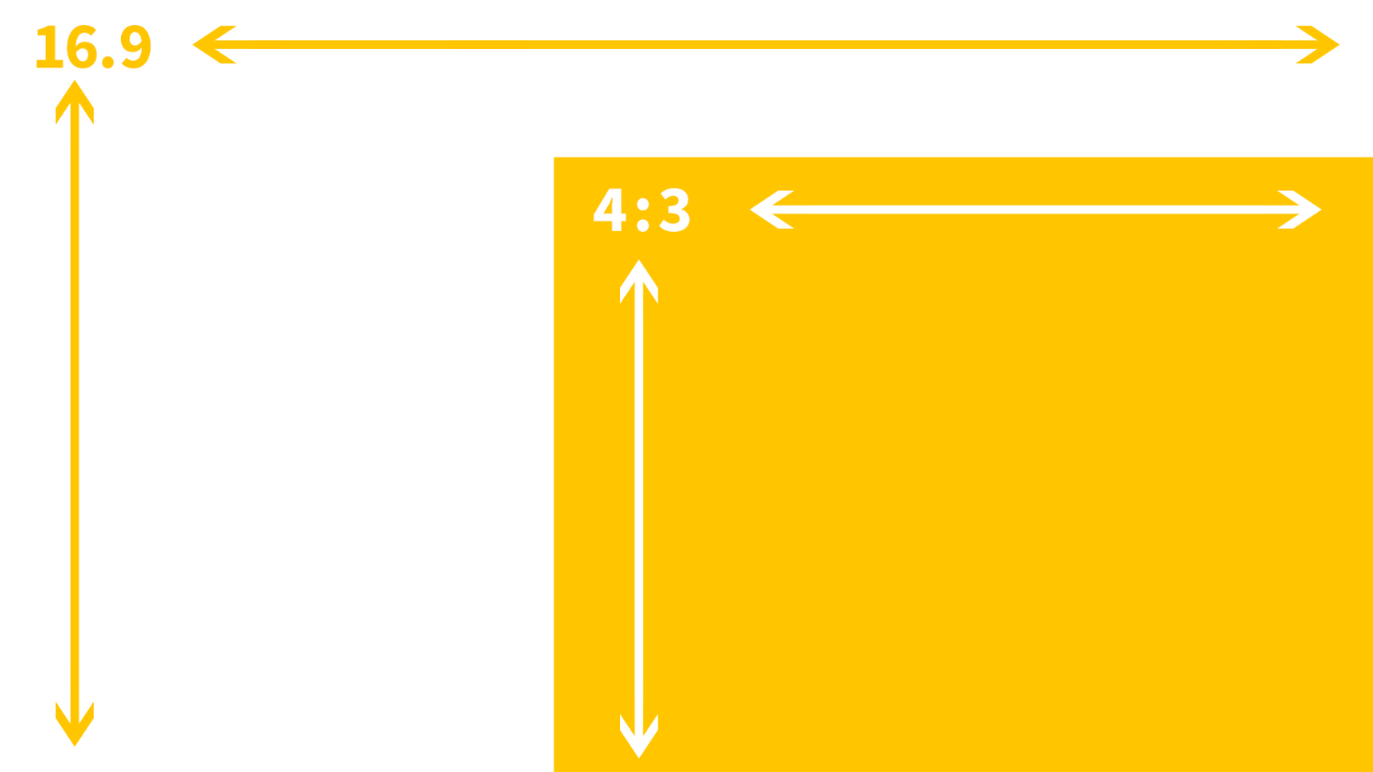
Aspect Ratios per Device
While images are optimized on your site, it does not actually resize the design of images on your site. If you use an image on the desktop that has an aspect ratio of 16:9, it will look perfect on the desktop since a desktop device is wide. A mobile device, however, is much smaller, and so a 16:9 aspect ratio will sometimes look small.
To compensate, you can either use the hide on device feature to create specific versions for those devices or you can resize the image's dimensions to fit. Changes to size are device independent.
Considerations
Biggest is not always the best
Uploading the biggest resolution for your site guarantees that your site's images are high resolution for your clients and customers. However, keep in mind that large images also have a drastic effect on your page speed. Since high-resolution images are scaled down, users do not normally notice the difference in resolution. It is better to upload images that are as large as how they are intended to be used. For example, if you have a picture that is 300px by 300px on your site, you do not want to upload it as a 4000px by 4000px image.
Image Editor
The Image Picker allows you to make quick edits to your site images. Crop or rotate the images in your site directly from the Image Picker.
Click an image on your site to open the Content Editor, and click Edit.
Use the menu at the bottom of the image to frame, add text, adjust, crop, and focus the image. Once you are happy with the image you have created, click Save & Close and the image is saved in your library as well as on the page.
- When you edit an image with the Image Editor, it is saved under Site Images.
- Images do not replace previous images when making edits, they create new versions.
- Keep in mind that some widgets allow you to add additional modifications such as drop shadows, borders, and overlays. Please see the instructions related to the widget you are using for more details.
Add Premium Images (Shutterstock Images)
Add Premium images to your site through our Shutterstock integration. You can try out a Premium image before purchase; these images display on your site with watermarks. You can proceed with the purchase at any time from the Content menu or the Image Picker menu.
To add premium images:
- From the location you want to add a premium image, click + Image.
- Search for an image, and filter for premium images by selecting Premium Images from the drop-down menu.
- Locate the image you want to use, and click Select. You have the following options:
- Try with watermark. To try the premium image before you purchase it, click Try with watermark. The image displays with a Shutterstock watermark.
It is possible to publish a site with a watermark image. The image displays with the watermark on the live site. - Purchase all. All images are $3.00. Premium image purchases are non-refundable.
Pending Purchases
If you choose to try an image with a watermark, the image goes into an Images Cart.
To see the Images Cart:
- In the left panel, click Content, click Site Content, and then click Manage Images.
- In the left panel of the Image Picker, under Site Images, click Pending Purchase.
- Select images you want to purchase, and click Purchase.
Although you can deselect a Premium image from displaying in a widget, it is not possible to delete a Premium image from your content folder or Image Picker.
Image purchases are single site licenses, meaning you will you not be able to transfer premium images from one site to another. For the same reason, premium images cannot be downloaded from the editor. To learn more, please view our article on image licenses.
Please note that client accounts are not able to purchase premium images. In regards to team members, admins will automatically be given permission to purchase premium images. For any other team groups, you will need to add the permission manually.
Resources
- To learn more about adding images to your site, see Image Widgets.
- To learn more about adding background images to your site, see Row Editor.
- To learn more about adding a Photo Gallery to your site, see Photo Gallery.
Video Backgrounds
Use Video Backgrounds to quickly add a video from YouTube, Vimeo or Dailymotion as a site background. Video backgrounds can catch a visitor's eye with moving content and add a stylish modern look to any site.
Note
Any file (text, image, video, and so on) uploaded to the system is publicly available. No personal and/or confidential information should be uploaded. To remove the file completely, delete the file from the picker.
Tip
All YouTube background videos display the video title and uploader before the video starts on load. There is no way to remove these items without manually changing the CSS. Due to this change, YouTube videos are not recommended for background video.
- To add a video background to your site, obtain the YouTube, Vimeo or Dailymotion URL you want to use.
- Right-click the row or column you would like to add this background to, then click Edit Design.
- Click the Video tab. You have the following options:
- Click Upload Video and select the video you want to upload. You can upload up to 200MB in all formats. You can upload video from your device, Facebook, Instagram, Dropbox, Google Drive or record a video using your webcam.
- Note
- This feature is still in development and will gradually be released to all customers.
- Paste the URL of the video you would like to use into the YouTube, Vimeo or Dailymotion URL textbox.
Considerations
- YouTube videos are not supported on mobile as they do not auto-play on iOS devices.
- Background videos will not play sound.
- Videos can take time and bandwidth to load, and can distract users from important links or text on your page, so use videos sparingly.
- Consider reducing the opacity of the video background to make the effect more subtle.
- When adding a Dailymotion video that is part of a playlist, make sure to only add the direct link to the video (and omit the playlist parameter, which looks something like this:?playlist=x1x2f3). If your video’s URL has this parameter, just remove it. For example: https://www.dailymotion.com/video/x60ktex?playlist=x5x6f2 would be https://www.dailymotion.com/video/x60ktex
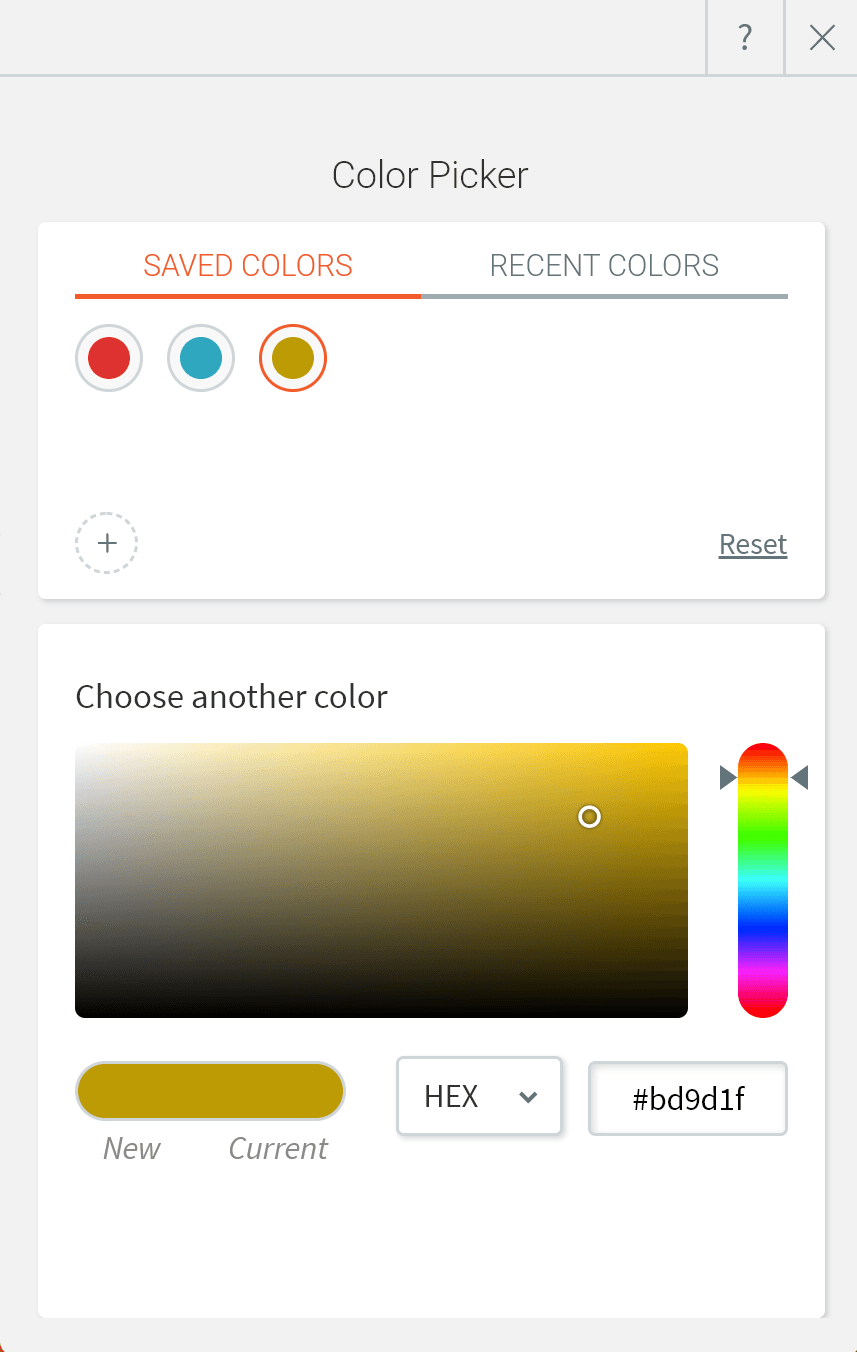
Use the Color Picker
Color Picker is the function of your editor that lets you manage color scheme of text, background, overlays and more. You can choose a color from the color palette, input a HEX or RGB value or even create a custom gradient. Recent colors feature will help you keep your color scheme consistent and maintain a professional look and feel on your site.
When working with the Color Picker, you have the following options:
Color style
Before you pick the color scheme, you need to choose where you want to use single color or a gradient.
If you are using single color option, you can pick a color from Recent colors tab or jump to Choose another color.
Gradient background will be an available option for row, column and widget backgrounds and image overlays. To apply a gradient, make sure to:
- Pick 2 colors of the gradient stops
- You can reverse the colors to adjust the stops positioning
- Choose gradient direction
- Center option will generate radial gradient
- Side options will create linear gradient
Saved Colors
Save colors that are frequently used across your site by adding them to the Saved Colors list in the color picker.
To add a color to the saved colors, click the Saved Colors tab on the color picker and click the + icon. To remove a color from the Saved Colors list, right-click the color and select Remove.
Note
You can save up to 48 colors and gradients in the Saved Colors list.
Recent Colors
When picking a color, the recent colors menu shows a sample of colors that were recently used in your site. This allows you to quickly pick colors that are already on your site.
Choose another color
Select a color's hue using the color palette on the right or the color panel. Alternatively, you can enter the HEX or RGB value of the color you want in text box below the vertical color gradient.
Opacity
The opacity slider determines the transparency of an element. Keep in mind that as you reduce an element's opacity, whatever is behind it (background image or color) will begin to blend with that element.
Considerations
- Gradient is not available for text elements, so you will not see it in a Color Picker for text elements in widgets design editor of Global Design tab.
- When working with backgrounds, switching between Color and Image will set the settings on the previous option to null. To give an example, if you were using a color and changed the setting to Image, any color or gradient settings will be removed.
- Gradients override individual button backgrounds. To change them back, reselect the background for individual buttons.