HOW TO BUILD YOUR WEBSITE
Website Editor Overview
The editor's interface has three main predefined sections: The top navigation bar, the left panel, and the content area. Each of these predefined sections plays an important role in letting you make your site as awesome as possible.
Top Navigation Bar
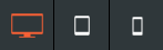
Use the top navigation bar navigate your site, both by moving between different pages and by moving between different device views. Click a page to view it, or click a device to see how your current page looks on that device.
The navigation bar has controls to undo or re-do simple actions in the editor, save your current site, and preview or republish your site. The top navigation bar also has an indicator for when changes in the editor are saved.
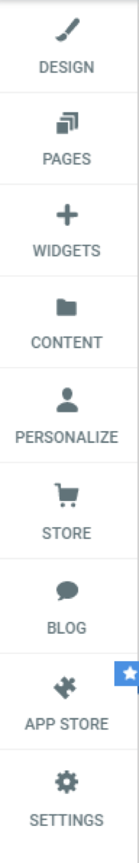
Left Panel
The left panel is contains all of the widgets and features. Here you can find tools to edit almost anything on your site.
The left panel has features to make broad, sweeping changes to the entire site. For example, changing the color scheme or button design in the Design tab, add new features and widgets with the Widget tab, change your pages' configuration in the Pages tab, and make administrative changes in the Settings tab (for example, changing the site's URL or adding analytics).
Content Area
The Content Area is where you can move or add any of our features, or click and edit to change them. The content area allows you to change images, text, edit and delete buttons, and more.
In-Editor Help
For help about certain functions in the editor, click the gray question mark (?) at the top-right of the screen to open the in-editor help for information about what the feature can do.
Row Editor
Use the Row editor to change the row's background color and image, add a border, or adjust the inner and outer spacing of the row. Use rows to organize and arrange the content in your site.
Warning
Before editing rows, create a backup of your site. This ensures that you will be able to restore a previous version of your site if you make a mistake. For more information about backing up your site, see Backup Sites.
To configure a row:
- Hover over the top left of a row until a row button appears, and click Row.
The Row editor appears. - Click the Move row up and Move row down arrows to move the current row up or down.
- To open the Row design editor, click Edit Design. For more information, see Row Design Editor.
The Row design editor appears. - Click +Add and select one of the following:
- Row above. Add a new row above the current row.
- Row below. Add a new row below the current row.
- Section. Add a section to the row.
- Column. Add a column to the row.
- Inner row. Add a row within the current row.
- To clear the inner spacing inside the row, click Clear Padding.
- To add an entrance animation to the row (for example, fade from right, bounce in, zoom in), click Entrance Animation, and select an option.
- To save the row as a section, click Save as Section and select to save only the current row, multiple rows, or the full page.
- To hide the current row on a specific device (desktop, tablet, mobile), click Hide On Device, and select the device.
- To copy the row, click Copy.
- To anchor the row to the page or delete an existing anchor, click Set As Anchor or Edit Anchor.
- To delete the row, click Delete.
Row Design Editor
To edit the background style or spacing of the row:
- Hover over the top left of a row until a row button appears, click Row, and then click Edit Design.
- On the Settings tab, you have the following options:
- Full bleed row. To change the row into a full bleed row, which allows content to span the entire width of the screen, click the Full bleed row toggle. If you choose not to have full bleed rows, the content width is limited to 960px.
- On the Style tab, select a use a Background Color, Image, or Video. You have the following options:
- Color.
- Select a Background color. Gradient color overrides image, and vice versa.
- Select a Backdrop filter. Backdrop filters allow you to apply graphical effects such as blurring or color shirting to the area behind an element. To see the effect, you must make the element or its background partially transparent since this applies to everything behind the element. Select a Filter Type from the drop down menu, and move the slider to select a Filter value.
- Click Border to select a border type, and move the slider to set the border width.
- To add a shadow, click the Shadow toggle, and select a color, type, and position for the shadow.
- Image.
- To add an image to the background, click + to open the image picker. To create a background image slider, select multiple images from the image picker, and see Background Image Slider.
- To enable parallax scrolling on the background image, click the Parallax scrolling toggle. When this is enabled, background content scrolls more slowly than foreground content.
- Select to have the image display as a Cover, Full image, Tile, or No repeat.
- Configure the Position, Background overlay, Border, and Shadow for the image.
- Video. Paste the URL of the YouTube, Vimeo or Dailymotion video in the field provided. For more information about video backgrounds, see Video Backgrounds.
Background Image Slider
After selecting multiple images in the image picker, click Done. Once the slider is created, select a Slide transition from the drop-down menu, and move the slider to select a Slide speed (seconds).
Any of the other background image options such as Background Overlay, Positioning, and display style can be applied to the slider.
Note
Background Image Sliders can be added to any column as well.
Global Design
The Global Design section lets you make global changes that affect your entire site. You can customize your site's text, buttons, images, background, and navigation widgets from this menu. This allows you to quickly and efficiently make sweeping visual changes, reducing design time and keeping your site's style consistent across pages.
In the left panel, click Design to open Global Design.
Changes that you make to specific widgets or pages will override these global styles. We recommend you first decide on a global style, and then make customizations to parts of your site that you want to stand out or look different than the rest.
Text Style
This section lets you control Text Style for your site, both for text and titles of all sizes (H1 to H6). Change the font size, style, color, and other edits that will affect the text for all future paragraph and title widgets.
Button Style
This section lets you control the style of the button widgets on your site. Select one of our button designs and set the background color, border style, and text. Choose other effects like adding rounded corners or shadows to the button.
Image Style
This section lets you control the style of the image widgets on your site. Select an image using the image picker and add or edit the border style, rounded corners, or shadow effects.
Row Style
This section allows you to define the global row design in terms of background color, default row spacing and default column spacing.
Note
Edits that will be made on individual rows will override the global row settings.
Site Background
This section lets you control Background Style for your site. Choose between using a color or image as your background. Changes also affect the desktop and tablet.
Site Layout
Control the site layout navigation on desktop, tablet and mobile. For the desktop version, you can choose from two widths: 960px or 1200px.
Note
Changing your navigation's layout often affects the behavior of your header and sometimes the rest of your site. If your header suddenly looks incorrect after changing the layout, try a different layout.
Customize Background
Customize the background of your site by selecting a color or image. Match the theme of your business by using eye-catching and creative backgrounds. Choose a custom background image from the photo gallery or upload your own images to add a unique site design. Your background can be customized per device.
Site Background
To customize your site background:
- In the left panel, click Design, and then click Site Background.
- Click Background for all pages.
- Click either the Color or Image tab or select a color for the site background or upload an image.
Background Per Page
To customize the background per page:
- In the left panel, click Design, and then click Site Background.
- Click Background per page.
- Select a page from the drop-down menu, and select image or color for the specific page.
Images & Content Background
The background of items above the site background can also be changed. These setting can apply to widgets as well as rows.
To edit the background of your content:
- Right-click the widget or row, and click Edit Design.
- Click the Style tab, and, depending on the widget or row, select a background color or image.
For any row or column, you can also add an image slider as a background.
- To create the background image slider, click on the + sign and select multiple images rather than a single image from the image picker.
- Once the slider is created, you can set slide settings such as slide transition style and slide speed from the row design menu:
- Any of the other background image options such as Background Overlay, Positioning, and display style can be applied to the slider.
Video Backgrounds in Rows
In the case of rows, a third option for video backgrounds will be available in addition to images and colors.
Videos can only be displayed on desktop sites, and must be hosted on Vimeo or YouTube.
Note
All YouTube background videos display the video title and uploader before the video starts on load. There is no way to remove these items without manually changing the CSS. Due to this change, YouTube videos are not recommended for background video.
Video Backgrounds in Columns
Videos are also available in backgrounds for columns as well. To add a video background to a column, click the column, then click the Video tab. Make sure that you have selected the column instead of the row. To check if you have selected the row, you can check the top of the menu, which should say Column Design.
Edit by Device
Edits made to one device appear on all devices. For example, when a row is deleted on the tablet view of your site, the row will also be missing on the desktop and mobile views of your site. This is because your site is responsive, thus sharing content across all devices. However, you may want to differentiate which content appears on which devices. You can use our edit by device features to accomplish this, and serve your visitors content that is appropriate for the device they are accessing your site from.
When making edits to a specific device, it is often necessary to switch views. For more information, see Switch Views.
View Information Bars
Some widgets and features may only appear on certain devices. To change the style of a widget on a certain device, click the device view on the top navigation bar to switch to that device view, and then make your change.
Hide-on-Device
Almost everything in the editor, with the exception of the header and footer, can be edited on a per-device basis by making the content specific to that device.
To edit content per-device:
- Copy the content that you would like to be device-specific. Right-click the widget, click copy, then click paste.
- Right-click on one of the widgets, select Hide on device, then select the device where you want the widget to be hidden. For example, setting a button to Hide on Desktop removes the button from the desktop, but displays the button in the tablet and mobile sites.
- Click on the original content and select Hide on device, then hide the content on the device(s) on which you do not want to change this content. For example, if you set your copy button to Hide on Desktop, you would set the original button to Hide on Tablet and Hide on Mobile. This way, you will have two different buttons; one showing on your desktop and a different one showing on your tablet and mobile.
- If you want the content to be different on all three devices, you can copy it again (so you have a total of three copies of the same content) and have a different button displayed on each device.
- You now have two (or three) identical, but different pieces of content, each displayed on a different device. Any further changes made to this content will only affect the device on which it is set to show.
Edits That Do Not Affect Other Devices
There are several edits in the editor that can be changed without affecting mobile. These are:
- Spacing (Margins and padding)
- Positioning
- Width
- Height
- Site/Page background
- Font size (it will not affect text that has been edited in mobile before)
Every other edit you make in the each device view will affect other devices.
Besides the list above, there are other edits that you can make to settings without affecting other devices too. These display with an Edits only affect this device icon in the editor.
Widget-Specific Changes
While some widgets work fine across all devices, there are some drastic differences between devices which creates a need for a different set of features or design preferences per device.
Below is a list of widgets with design suggestions and notes for tailoring certain widgets on certain devices.
Background Images
Due to drastic differences in aspect ratios between devices, it's important to take special care with how you design images in your website.
For example, a full page background on a row might look great on a desktop device, but horrible on a mobile device. This might be because desktop devices are more suited to larger width images, while mobile is the exact opposite.
You can set a different Page background per device in the global design settings. It's recommended to use a wide background image for desktop, and a narrow one for mobile or tablet.
Slider Widget
As with the background image, the images you selected for the desktop version of the slider widget may not look as great for tablet or desktop. It's recommended to either:
- Adjust the frame size for the slider to fit on mobile or
- Hide the slider on desktop, and create a version specifically for mobile instead
Images and Icons Widget
The image widget's size is not automatically adjusted in the mobile version. It's important to check your mobile devices where the image widget is used to make necessary adjustments to fit.
Hover Effects on Tablet/Mobile devices
Compared to desktop devices, tablet and mobile devices do not have a hover effect at all. Any hover layout or option is disabled on tablet/mobile devices.
Maps Widget
The Map widget has device specific options for when it will show as a button or a map.
Contact Forms Widget
Contact forms will always appear one input per line on mobile.
vCita Widget
The vCita online scheduling widget has an option to only show a button, on the device of your choosing.
Considerations
When editing device specific widgets, remember to check all views before publishing your website. Widgets can be easily misplaced when using the 'Hide on Device' option.
For more information about switching views, read this article.
Switch Views
Responsive websites work on desktop, tablet, and mobile. For this reason, our responsive editor lets you preview the site in each of these views while editing. This lets you check how your site looks on different devices before you publish, ensuring that your customers have a positive experience no matter what device they are using to view the site.
To switch device views, click on one of the device buttons in the top navigation bar:
The different device views are not separate versions of your site. Deleting an element in one view (for example, mobile), removes that element from the entire site (desktop, tablet, and mobile). Instead of deleting, right-click on the element and select to hide an element on a specific device.
Device previews do not always reflect precisely what you see on an actual device. Features like fonts, size of the device window, user interface and browser behavior can all cause these previews to be inaccurate to various degrees. For the most accurate version of the site, check on a real device.
Sidebar Layout for Desktop
You can change your desktop site layout to a sidebar layout. Sidebar layout displays the header on the side of the site (either left or right) and is a great design tool to give a unique look to your site. The sidebar header also acts as a sticky header so it will always be displayed on the screen and you can also add widgets into the sidebar like any other row.
Note
- When you switch from a traditional site layout to a sidebar layout, the header keeps the logo, and all the widgets you had will be removed (similar to switching the header layout on the top header layout). The background color will be changed according to the layout you selected.
- The shrinking header is not available for the sidebar navigation. The sidebar is always displayed on the site regardless of the site scrolling.
- On screens smaller than 1090 pixels width, the content of the sidebar except the first image will be hidden and an expand menu icon will display. You can customize the color of the trigger button that appears in the design editor.
To change your site layout to a sidebar layout:
- In the left panel, click Design, and then click Site Layout.
- Select the sidebar layout, You can add rows, drag and drop widgets into the sidebar header and customize it.
To edit the design of the sidebar header, hover over the sidebar, and click Sidebar at the top right corner. You can choose one of the multiple sidebar header layouts to apply to your site, display it on the left or the right side of the screen, define its width, and more.
Global Text
Change the style and look of the text on your entire site. You can change font type, size, and also choose settings for normal text, links, and titles. This gives you the opportunity to give the content of your site a distinctive feel, and make sure your visitors can read it!
- In the left panel, click Design.
- Click Global Text.
- You can change the font size, and color as well as text direction and link text options.
- You can also change the properties of titles by making edits under Global Title. The H1, H2, H3 and so forth refers to the headings and subheadings.
Making changes to text using the Global Text menu changes all text in the site. Edits to individual elements override the global style. For example, setting the global text color to red makes the text in all paragraph widgets that are added to the site red. However, text in text widgets that are already part of the site will stay the same. For more information, see Global Design.
Headings and Subheadings
When making changes to titles, make note the differences between H1 - Title Style, H2 - Title Style, H3 - Title Style, and so forth. These different titles refers to headings and subheadings. H1 titles refer to the main heading, while H2 titles are subheadings of H1. H3 titles are subheadings of H2. When changing Title Style options, make sure to understand the differences between headings and subheadings.
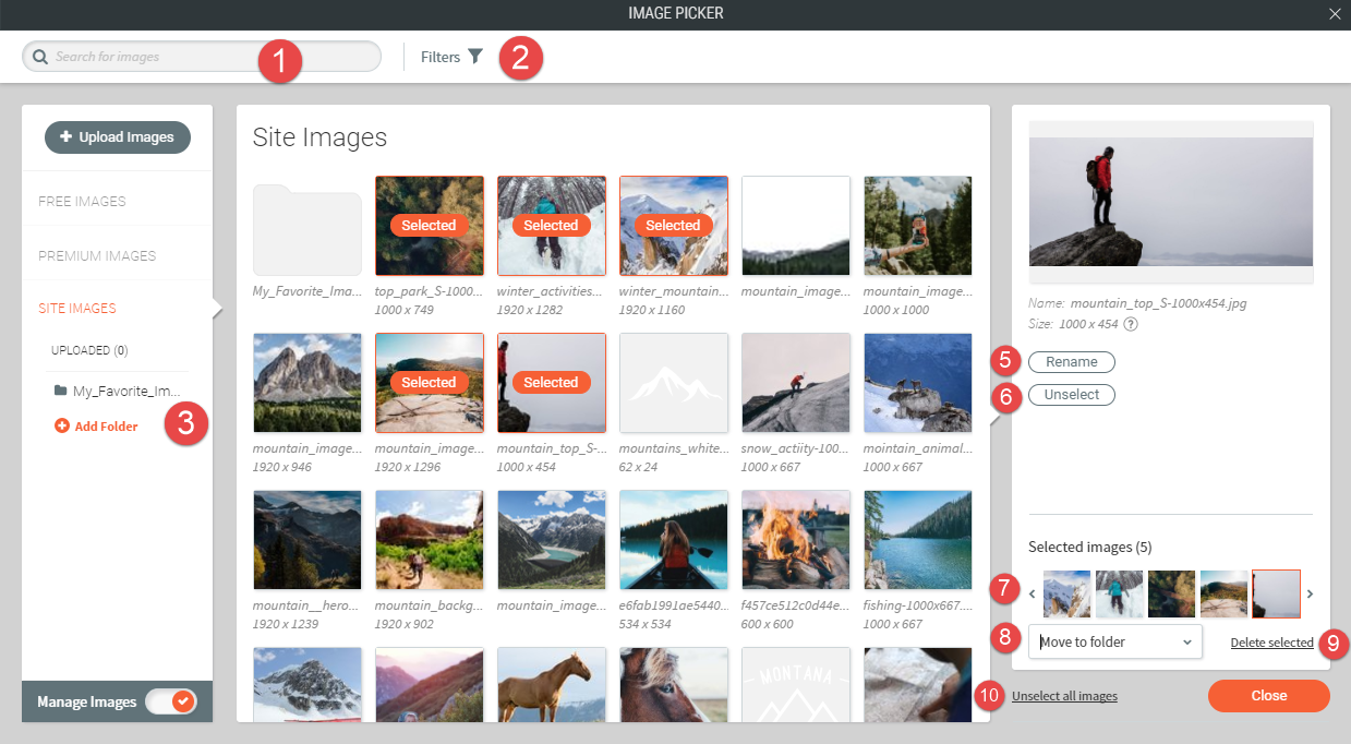
Image Picker
The Choose & Place Images menu allows you to select images to be used in various widgets on your site. You can add images to your site from almost anywhere, including your existing site, Facebook account, computer, other sites on the internet, or our built-in stock image collection. This gives you access to a huge variety of image options to suit your site, so you can find exactly the right image to represent your business.
When selecting images to use on your site, by default the editor uses the quick picker.
The editor supports the SVG file format. You can use SVG images with the icon widget.
Note
Any file (text, image, video, and so on) uploaded to the system is publicly available. No personal and/or confidential information should be uploaded. To remove the file completely, delete the file from the picker.
Quick Image Picker
The quick image picker is a simple way to choose images. You can select images from your folders or from images that we have already pulled into the platform.
We use infinite scrolling, so just scroll down to reveal more images on this window.
With the quick picker open, you can:
- Select the folder with images you want to use.
- Click the + icon to upload your own image.
- Switch to the Full View for more image choice options.
Full View
Image Sources
The responsive editor automatically displays images from a number of different sources, including:
- The site you are importing (if you import a site)
- Free images from various sources (such as Unsplash)
- Related Facebook business page
- Uploaded images
You can select between these sources by clicking through the tabs on the left.
Choose Images
Simply select an image to get more information about it. You can see the size, name and more on the right side after you've selected it.
Upload New Images
Click Upload Images to upload a new image from your computer.
If you prefer to upload your own images via Facebook or another method, you can close out the initial dialogue box and click Upload from... instead.
Additionally, you can upload images directly to a folder by selecting your designated folder before selecting Upload Images.
You have the following options:
- Search for web images from Wikipedia and Google Images.
- Add images from Facebook, Flickr, Dropbox, Google Drive, Google Photos, or a specific URL.
- Upload images from your computer by dragging an image from your computer into the marked section.
Add Images
To add an image, click the image to select it.
When selecting images for the Image Slider or Photo Gallery widgets, you can select multiple images at one time. As you do, each image will be surrounded by a colored border. When you click Done, all selected images will be added to the widget.
Manage Images
You can organize and manage your images to make updating your site's content more streamlined. With the image picker window opened, click the Manage Images toggle to switch modes.
There are many options available in this mode.
Manage and Import Content
Provides a place to store and retrieve images, files, and information for your site. The Images & Content section allows you to quickly add new images and access existing images, files and information. File size limit is 50 MB.
Note
Any file (text, image, video, and so on) uploaded to the system is publicly available. No personal and/or confidential information should be uploaded. To remove the file completely, delete the file from the picker.
Note
Changes made to specific widgets on the site override content added to the Content menu.
To access content, in the left panel, click Content.
Import Content
To import your own content onto the site, in the left panel, click Content, and then click Import content. Type your Site URL or Facebook page and click Import.
Collect Content from a Client
To collect content directly from the client, in the left panel, click Content, and then click Collect from the client. Copy and send the URL to the client so that they can upload their own content. To disable forms so clients cannot change the business information, select the check box.
The Import Content tool does not always allow you to import all of the content on a site; it is limited by what our robots are able to see.
Manage Images
Select existing images in the Photo Gallery or add new custom images by clicking Upload New Image.
Manage Files
To upload a file, click Upload New File. When hovering over the file, a gray X button appears in the top right corner. To delete files, click the X.
Manage Form Responses
To delete responses received through a contact form, in the left panel, click Content, and then click Manage Form Responses.
The Form Responses page allows you to remove any response to any form on the site. You can search for relevant responses in the Search visitor info search box. Ensure you search for the exact name, phrase or characters.
Business Information
To add or edit information about your business, in the left panel, click Content, and then click Business Info. You can choose to enter one or more of the following:
- phone numbers
- email addresses
- addresses
- social accounts
This information will automatically be used in relevant widgets.
Add a Facebook Profile
When entering your Facebook URL in the URL section, make sure to use the proper Facebook ID for your page:
https://www.facebook.com/ + ID of the page
Find the Facebook Page ID
The Facebook Page ID is at the end of the URL, as shown in bold in the examples below:
https://www.facebook.com/</wbr>123456789123456
Business Text
Give more information about your business to site visitors. Describe your business goals and explain why customers should use your products or services. In the left panel, click Content, and then click Business Text. Enter one or more paragraphs of information in the following sections:
- About Us
- Company Overview
- Business Services
You can later reference this information when building your site.
Find and Replace
This tool lets you automatically search your site for certain addresses, phone numbers, emails, and social media options and replace them when you need to update them.
In the left panel, click Content, and then click Find and Replace.
Add Sections
Sections are pre-built rows of elements which users can add to their responsive sites. Sections enable users to build great looking sites quickly by saving time during the design process. The infrastructure was built in order to provide a better user experience with a variety of pre-made sections.
Add Sections
To add sections of widgets:
- Hover between rows, and click the Add Section button. Sections display in the left panel.
- In Section Mode, a gallery of pre-made sections is available in the left panel, grouped into categories (Intro, Features, About, Team, Testimonials, and so on).
- In the left panel, click a section to display it as a new row. You can then browse sections within the same group by using the arrows keys or by selecting a section from a different group.
- To embed the section into the site, click Save. Alternatively, click Save & Add Another to continue adding sections to your site.
The section converts into a row and all elements in the section are editable.
Note
- Sections do not use any custom CSS, and are all build within the editor by designers.
- Sections do not use the text color or text font settings from the global design settings. However, you can always clear the format and apply your design.
- Sections may contain more than one row.
- Sections cannot be used in the header. To switch the full header section, open the header editor. For more information, see Headers.
- Sections are not available for sidebar templates (for example, Portfolio, Milk and Cookies, and so on).
Arrange Content
How you arrange the content on your site is really important. Arranging content well makes it easy for visitors to find what they are looking for, and allows you to highlight sections of your site that might otherwise be overlooked. A well-organized page makes your site look professional and helps increase sales by making it easy for site visitors to find what they are looking for.
Website Builder Structure
The Website Builder is built from a header, footer, rows, and columns. Every widget you add is inserted into one of these sections.
Widgets often take up the full size of a column or row, making it difficult to select them. To get around this, right-click the widget in the column or row you want to select, hover over the Select Container option, and then select either Column or Row.
Rows
Rows are the horizontal sections of your site. When you add widgets and columns to your site, they are placed within these rows. To change how content is displayed in the mobile view, click the reverse column order toggle in the row editor.
You can add rows to your site by dragging widgets into the site. When you drag a widget between rows or into a space where want to add a row, a new row will be created when you drop the widget.
To delete a row, right-click anywhere on the row to open the context menu, and then click Delete. Alternatively, click the Row button at the top left corner of the row and click Delete.
Columns
Every row contains at least one column. Columns contain all the widgets in your site and control their arrangement.
Every row can contain up to four columns. Whenever you add a new column, it appears alongside the existing column in that row.
Note
- While desktop and tablet views allow each row to hold up to four columns, mobile websites can only show at most two columns in a row.
- Columns added in desktop or tablet views will assume the full width of the page when switched to mobile view; to create a row with two columns in the mobile view, first switch to mobile view, then add a two-column widget.
To delete a column, right-click anywhere on the column to open the context menu, and then click Delete. Alternatively, click the red X at the top right corner of the column.
You can place widget directly into columns, or structure the column further by adding inner rows.
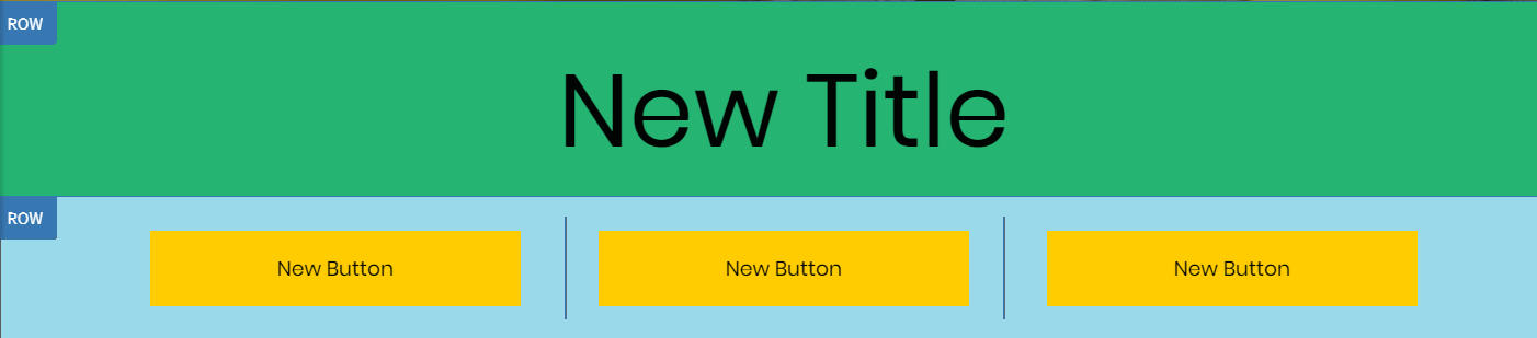
Add a row. By default, each row contains a column. Add 2 inner rows to the column. Place the Title into inner row 1. Split inner row 2 into 3 columns. Place a button in each column.
- These two inner rows will share the main row background, spacing and bleed.
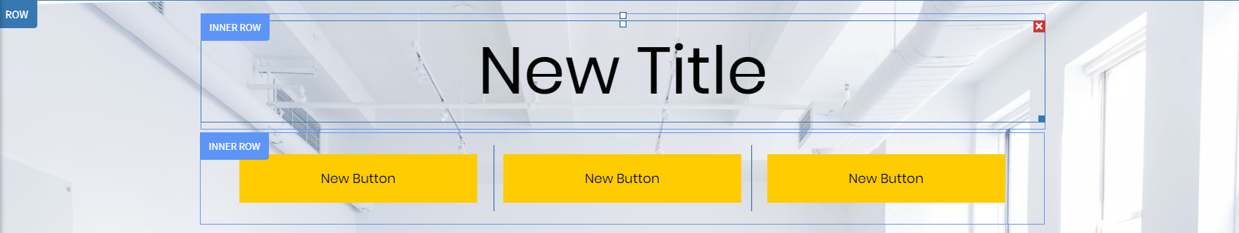
Some important considerations when it comes to editing inner rows:
- You can only use the order switching arrows to switch the order between inner rows. To switch the order of widgets and inner rows, you need to manually drag and drop the widgets above or below the inner row.
- 2 columns, 3 columns, 4 columns widgets cannot be placed in inner rows. To add a column, right-click the row and click Add Column.
- Unlike regular row, inner rows cannot be copy-pasted.
Widgets
Widgets contain the text, images, buttons, and other content of your site.
To add widgets to your site:
- In the left panel, click Widgets.
- Search for the widget you want, and then drag and drop it into your site.
To delete a widget from your site, right-click anywhere on the widget to open the context menu, and then click Delete. Alternatively, click the red X at the top right corner of the widget.
To arrange widgets side by side, drag a widget onto your site, add a column to the row where that widget has been placed, and then drag another widget into that column. Alternatively, drag the two-column widget onto your site and then drag and drop the widgets into each column.
Snap to Align
While resizing widgets within the same column, Website Builder attempts to Snap to Align them to be the exact same size. As you resize, Website Builder jumps ahead or behind to snap to location. This should make it easier to make widgets the exact same size.
Snap to Grid
The Snap to Grid feature helps lay widgets in the pages of your site with professional precision. This system allows you to align widgets horizontally and vertically within columns and rows. Rulers are presented when moving an element in its row or column, or when resizing the widget. The aligned elements are marked with a colored border. A widget may be aligned with more than one other widget, depending on the specific use case.
Note
Alignment is supported in the views of the three different devices (desktop, tablet, mobile).
For more information about adding and editing widgets, see Add Widgets and Edit Widgets.
Copy and Paste
Creating a site takes time and dedication. You can make this process easier and more efficient by using the Copy and Paste feature. Copy elements and rows in your site, creating exact duplicates in order to create identical rows or elements for your site.
You can copy and paste using keyboard shortcuts. To copy, use CTRL+C (Command+C on Mac). To paste, use CTRL+V (Command+V on Mac).
Note
You cannot copy and paste widgets or pages between sites.
To copy and paste widgets:
- Right-click a widget, and click Copy.
- Right-click the area you want to paste and click Paste to insert the widget into the row. The duplicate widget appears above the currently selected widget.
To copy and paste a column:
- Right-click to open the column, and click Copy.
- Open the Row menu to paste the column into a row. You can paste the column into any row on your site, including the header or footer. Please be advised that you can only paste up to four columns into any one row.

Quick Access
The Quick Access tool allows you to find editor functions and features by searching in the Quick Access search. You can also open associated help articles by clicking the question mark.
To open the Quick Access tool, click the magnifying glass () icon in the top navigation bar or use the keyboard shortcut CTRL+K / ⌘ + K.
Use Quick Access to do the following:
- Add widgets
- Open the add pages popup
- Navigate anywhere on the left panel
- Access support articles
- Go to specific page

Show Hidden Elements
At any time, you can see all of the hidden widgets on a page by clicking the Unhide Elements () icon at the bottom of the left panel under Settings.
Note
The Unhide Elements icon only displays if you have hidden elements in your site.
To unhide elements:
- Click the hidden element in the editor.
- In the left panel, click Unhide Element ().
Hidden elements are now displayed. - Once hidden elements are displayed, to restore them, click on the element, and then click Yes on the message.
Note
If you are using the unhide element feature and it does not reveal an image on your site, your image might need to be added and uploaded.
Keyboard Shortcuts
Keyboard shortcuts are combinations of keys that perform certain tasks when pressed simultaneously. Usually, these tasks require the use of a mouse, such as right-clicking to copy a widget. Learning to use the editor's built in keyboard shortcuts can save you time, and make the process of editing your site much quicker.
When using a Mac, substitute Ctrl with the Command button. For example, to access Preview on a PC, type Ctrl+Alt+P. On Mac, type Command+Alt+P.
In-Editor Shortcuts
The following keyboard shortcuts are available in the editor:
- Preview. Ctrl+Alt+P
- Open Dev Mode. Ctrl+Alt+C
- Open Original Site (if site is imported). Ctrl+O
- Copy Element . Ctrl+C (while hovering over element).
- Paste Element:. Ctrl+V (Paste copied element above currently hovered/selected element).
- Undo. Ctrl+Z
- Redo. Ctrl+Y
Text Editor Shortcuts
The following keyboard shortcuts are available when editing text:
- Bold. Ctrl+B
- Italicize. Ctrl+I
- Underline. Ctrl+U
- Align Text. Ctrl+R, E, L
- Remove Text Formatting. Ctrl+0
Developer Mode Shortcuts
The following keyboard shortcuts are available in developer mode:
- Find. Ctrl+F
- Find and replace. Ctrl+F + Ctrl+F
- Alt+Space. Enable suggestions while typing
- Save. Ctrl+S
- Duplicate selected line. Ctrl+Alt+UP
- Move Line Up. Alt+Up
- Go to line #. Ctrl+L
- Toggle comment. Ctrl+/